Front Matter
Title: WyzQuests Platform: UI Consistency, Design Tokens & Responsive Standards
Metadata:
Author: Jethro Magdaleno Lagmay
Reviewers: Reviewed by QA Team, Maintained by Dev Team
Creation Date: July 2, 2026
Status: Published
References:
Design Token Guide MD
globals.css
Introduction & Goals
Problem Summary: As WyzQuests scales, UI fragmentation occurs when developers use custom CSS, hardcoded hex values, or rebuild existing components. This document establishes the technical standard for leveraging our centralized design tokens (globals.css), Tailwind CSS, and Shadcn UI to guarantee a consistent, mobile-responsive experience across the platform without heavy custom engineering.
Goals & Non-Goals:
Goals: Ensure 100% adherence to CSS variables for colors, typography, and spacing. Establish a mobile-first responsive strategy. Standardize the usage and extension of Shadcn components.
Non-Goals: We are not building a custom component library from scratch. We are not overriding Shadcn base behaviors unless strictly required for accessibility.
Glossary:
Design Tokens: The semantic variables (e.g.,
--primary,--muted) defined inglobals.cssthat dictate our visual brand.Shadcn UI: Our foundational component library. It provides accessible, unstyled components that we style using Tailwind.
cn(): A utility function (combining
clsxandtailwind-merge) used to safely merge custom Tailwind classes into base Shadcn components.
High-Level Architecture
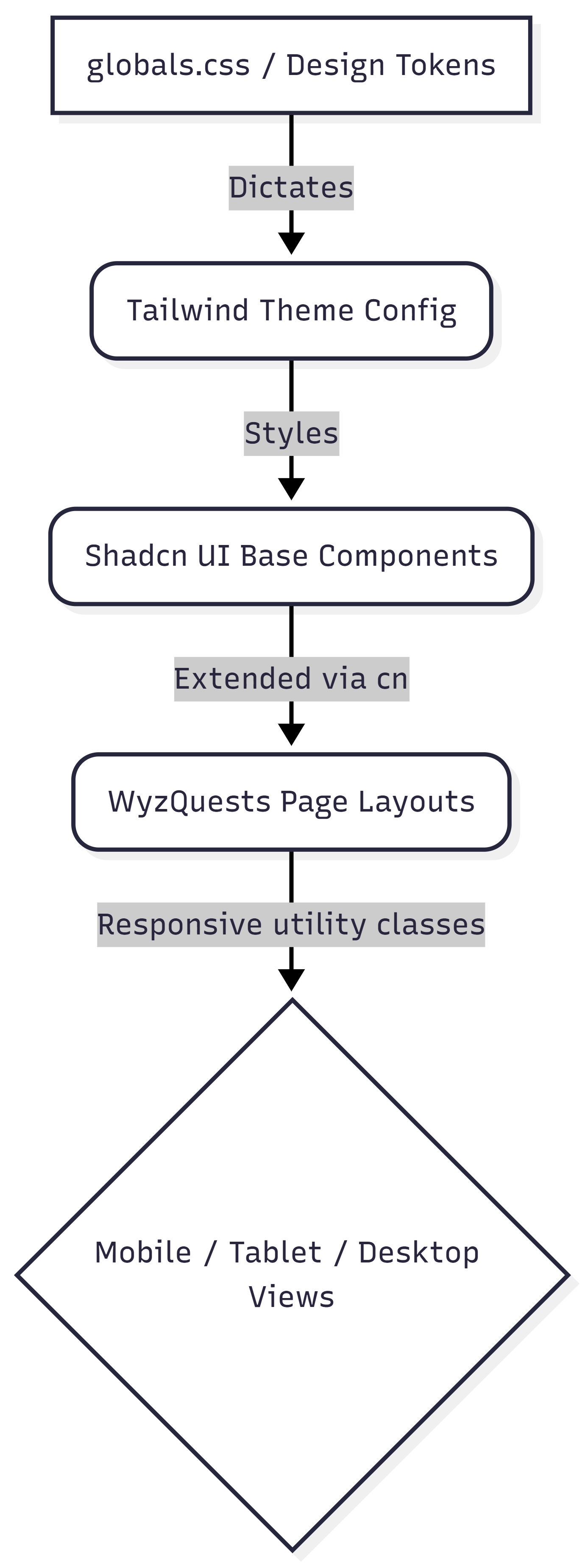
Technologies Used:
Framework: React / Next.js
Styling: Tailwind CSS, PostCSS
Component Library: Shadcn UI (built on Radix UI primitives)
Utilities:
tailwind-merge,clsx,lucide-react(for icons)
Detailed Design & Implementation
Data Model / Schema (Design Token Mapping):
Instead of database tables, our "schema" is our CSS variable structure. No hardcoded colors (e.g., #FF0000) are permitted in component files.
Token Intent | CSS Variable (globals.css) | Tailwind Class Example |
Main Brand |
|
|
Backgrounds |
|
|
Borders/Lines |
|
|
Shapes |
|
|
API Specification (Component Extension Rules):
Our "API" dictates how developers interact with shared UI components.
Rule: Never modify the base files inside
components/uiunless fixing a global bug.Implementation: Always pass page-specific styles via the
classNameprop using thecn()utility to prevent CSS class collisions.
Logic & Workflows (Mobile-First Responsiveness):
All layouts must be developed with mobile screens as the default state.
Mobile Default: Write base utility classes for screens < 640px (e.g.,
flex-col,p-4).Tablet/Desktop Scaling: Apply layout shifts using Tailwind breakpoints (
sm:,md:,lg:).Example:
<div className="flex flex-col md:flex-row gap-4">
Touch Targets: Interactive elements must retain sufficient padding (
p-2minimum) on mobile to prevent usability issues.
Infrastructure & Operations
Dependencies:
This UI layer relies heavily on Radix UI (headless accessibility primitives under Shadcn) and the Tailwind Engine at build time.
Monitoring & Alerting (Visual QA):
Performance Metrics: Monitor Cumulative Layout Shift (CLS) via Lighthouse to ensure responsive design shifts do not cause UI jumping during load.
Visual Regressions: (If applicable) Integration with tools like Chromatic or Percy during PRs to catch unintended CSS variable changes.
Deployment Plan:
Updates to
globals.cssor Tailwind config must be tested across both Light and Dark modes locally before merging, as these affect the entire application tree. (Dark mode isn’t applied yet, but this is good practice)
Testing & Quality Assurance
Test Strategy:
Responsive Testing: Developers must manually resize viewports down to
320pxwidth (standard minimum mobile) before opening a PR. No horizontal scrolling should occur.Accessibility (a11y): Ensure Shadcn's base ARIA attributes remain intact when composing larger layouts.
Known Limitations:
Certain legacy components (built before Shadcn integration) may still contain hardcoded values. These should be refactored to use
globals.cssvariables as they are encountered.
Maintenance & Support
Troubleshooting (UI Cheat Sheet):
Issue: Component looks slightly broken or margins are overlapping.
Fix: Check if Tailwind classes are conflicting. Ensure
className={cn(..., className)}is being used properly in the component definition.
Changelog:
v1.0.0: Initial standard established for Shadcn and
globals.cssintegration.
Document version: 1.0.0
